There is not that many of them to be frank, and don't expect quality for some time. On the bottom of the page I wrote my excuses.
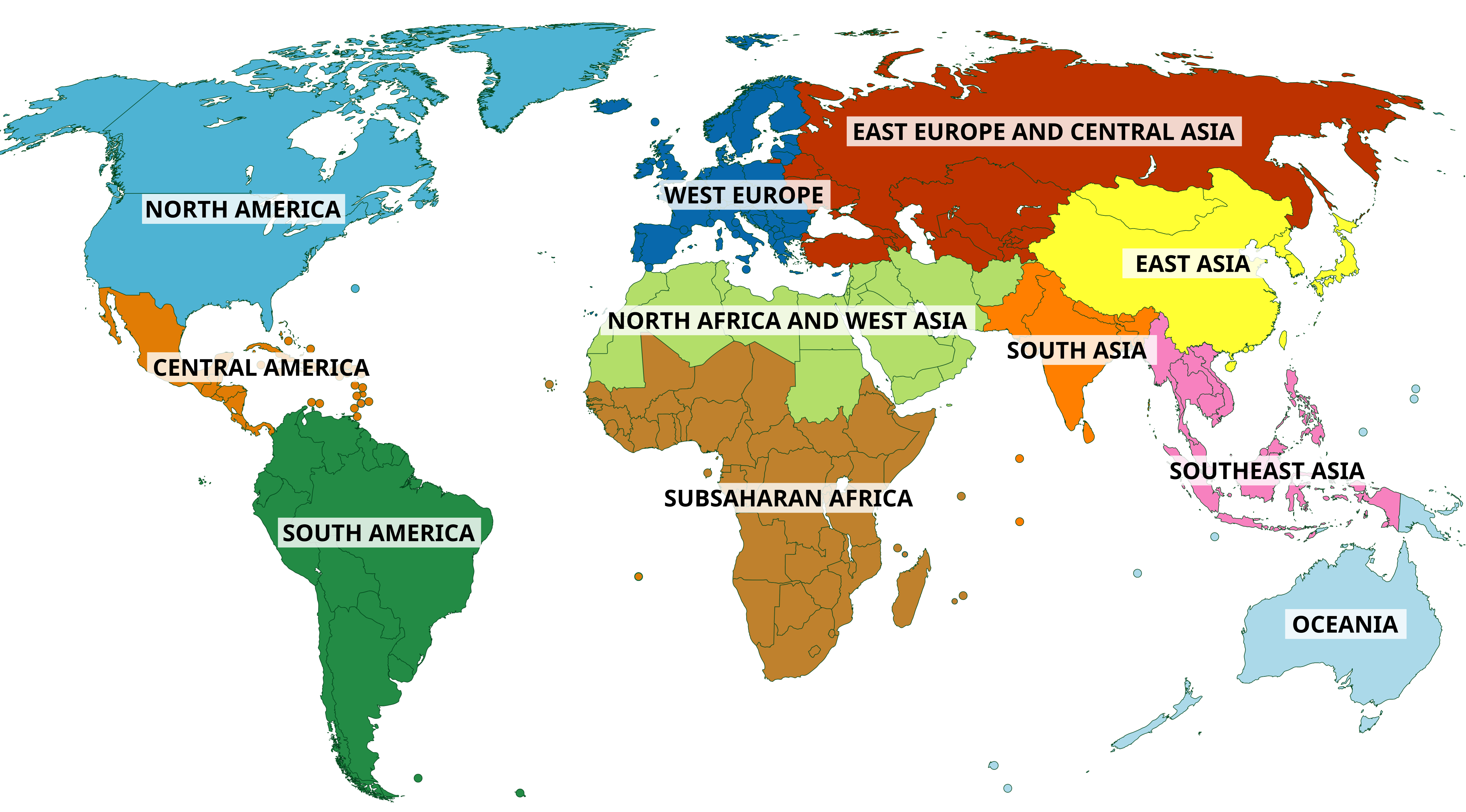
I think that continent is a social construct. It's not an objective 100% fact like tectonic plates and it's not 100% artificial object like a country. The debates whether for example Turkiye is Europe or Asia are meaningless and their goal is to arbitrarly include or exclude somebody. Australia is Europe because they have representation at Eurovision, who cares. That's why I've made a bunch of equally arbitrary divide of the world into regions similar to continents and that's the most recent one. And I love New Zealand west of Australia.
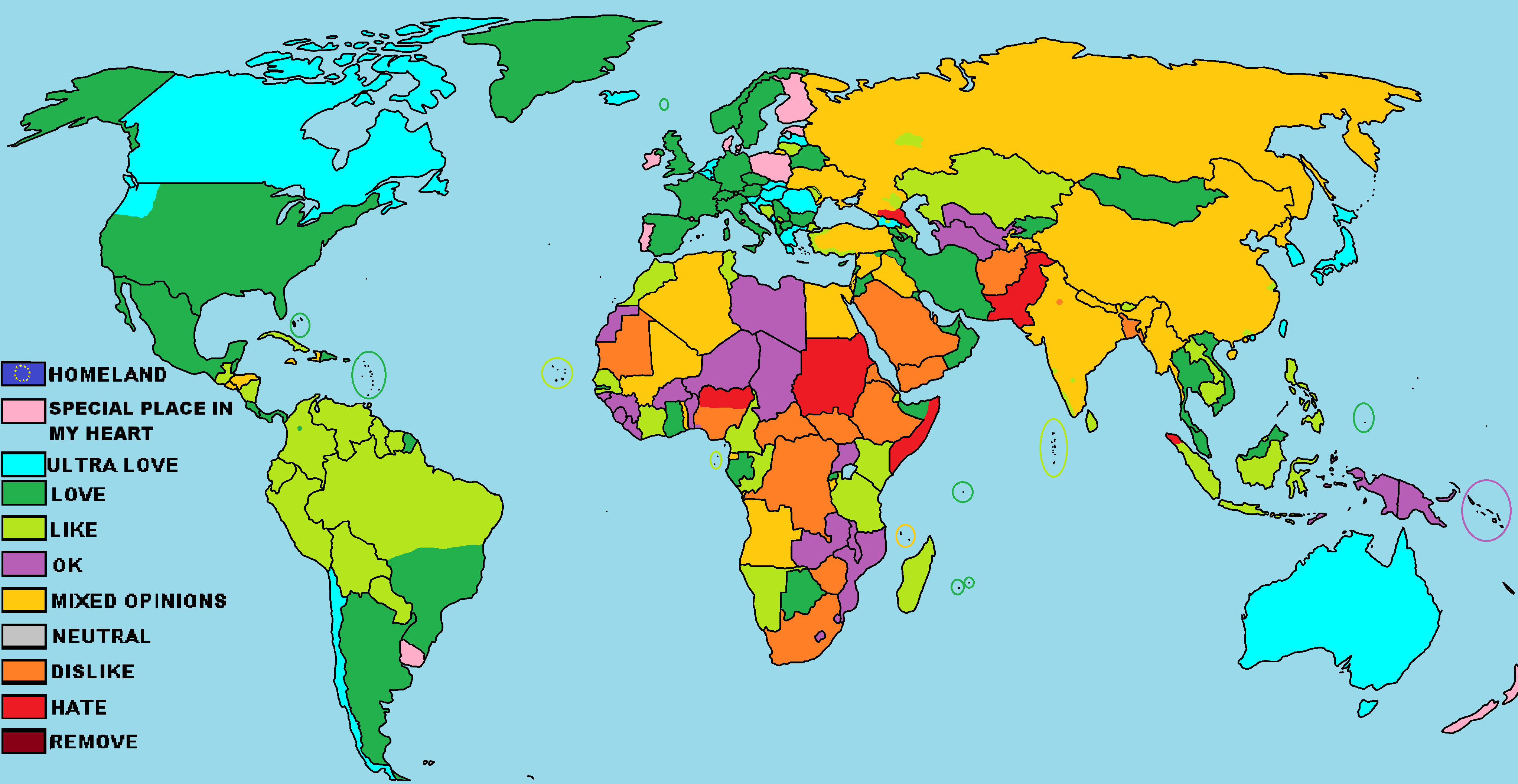
That is a map of my personal opinion about the countries in the world from about 2019. A lot has changed since then, and my opinions became much more nuanced and tamed, to the point that when I tried to fill the new version of that map, I can't help but be conflicted about almost all the countries. The format of this map is just a small sized png template that I colored in MS Paint and posted it on some polish map group.
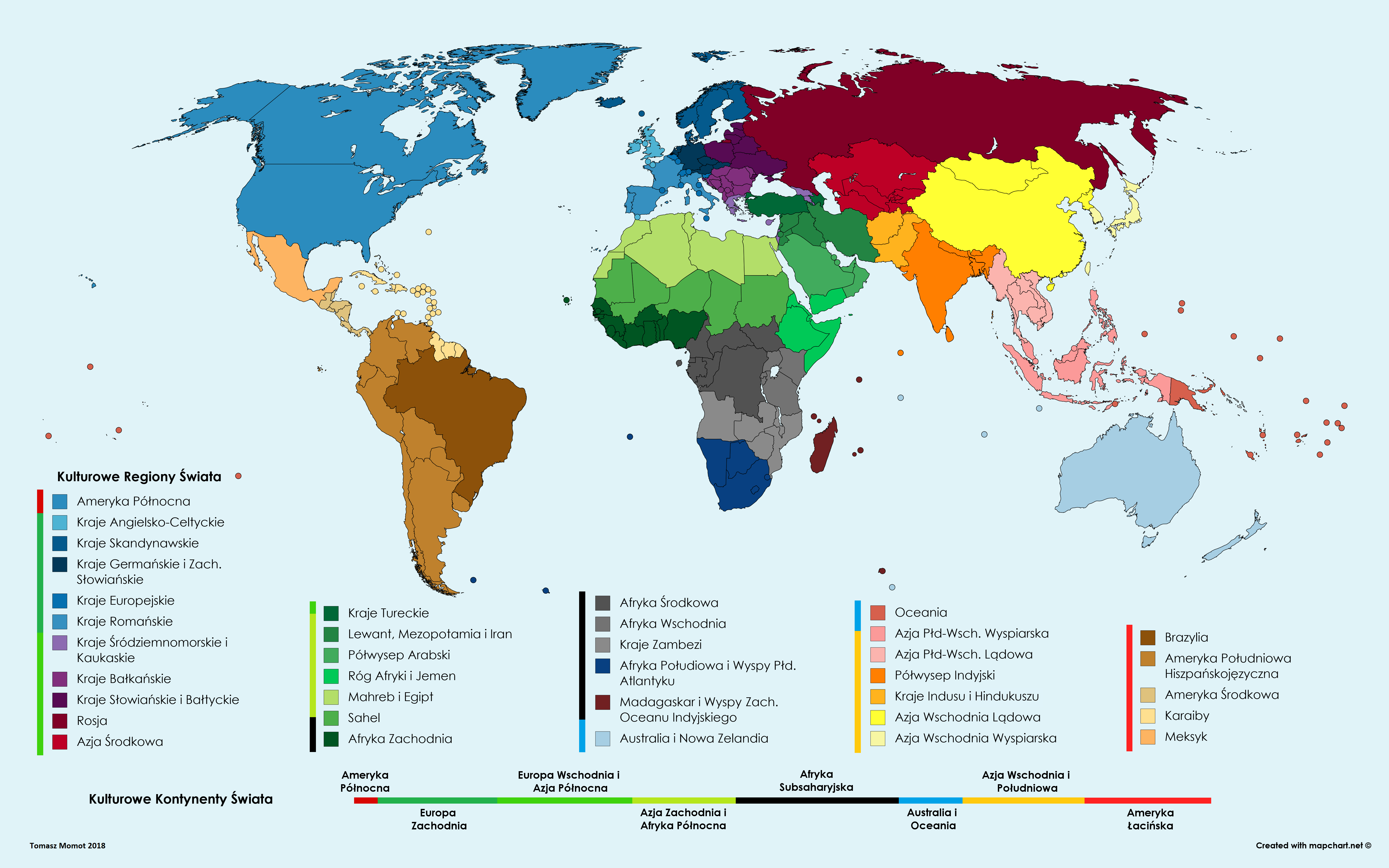
My yet another opinionated map about the world, but this one is about cultural spheres of the world. The idea was to make an ordered list of countries that are similar to each other that also make a seamless "cultural loop" if that make sense.
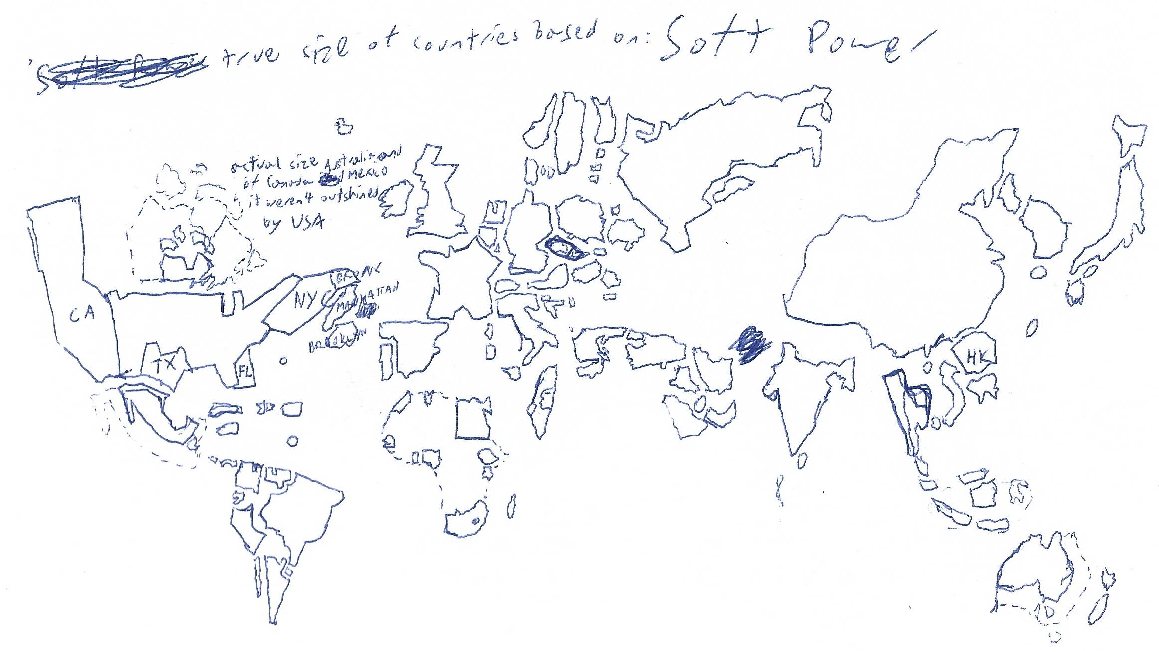
That's my quite recent attempt to analyze and present by cartogram, the soft power of countries in the world. Australia, Canada and Mexico are outline in two different sizes as their cultural output is often unwittingly credited to the US. I also marked some major districts of NYC as they alone are well known enough, as well as Hong Kong. Obviously this whole doodle is fully subjective and outdated.
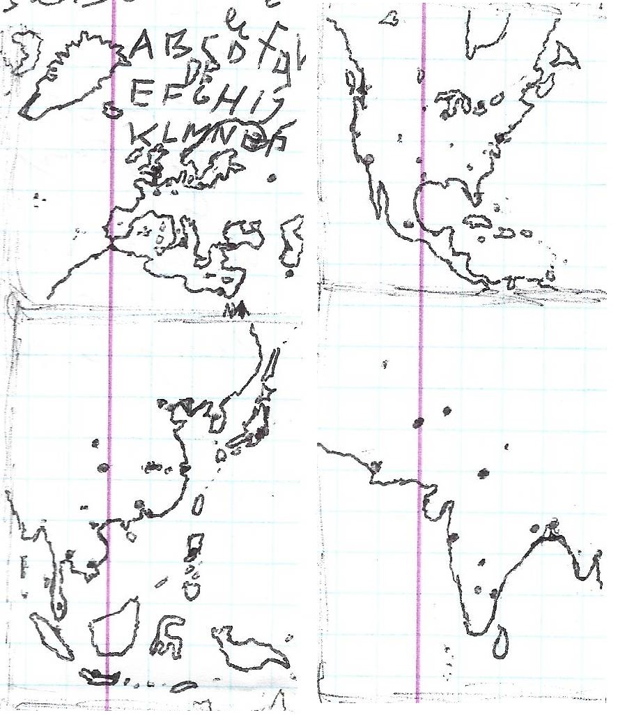
Those are tiny, hand-drawn maps of a bunch of continents entirely from memory with some major city dots, drawn on some notebook margin. I remember a lot of details but I'm incapable of memorizing all the shapes of northern almost uninhabited Canadian islands as there seems so empty, void of any cities that I can't remember any coastal details.
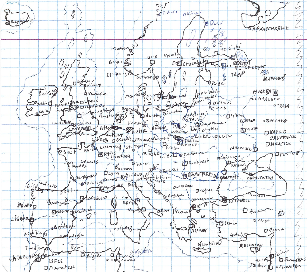
That's the map of Europe that I've drawn during some boring lecture in 2019, completely without any real map to look into. It's definitely not perfect, but accurate enough to pinpoint all major places with ease. I can proudly say that I still remember Europe with even more details and, to some extent, I am able to draw the rest of the world with all countries, capitals, almost all cities with at least 1 million people, major landscapes, mountain ranges and some rivers too.
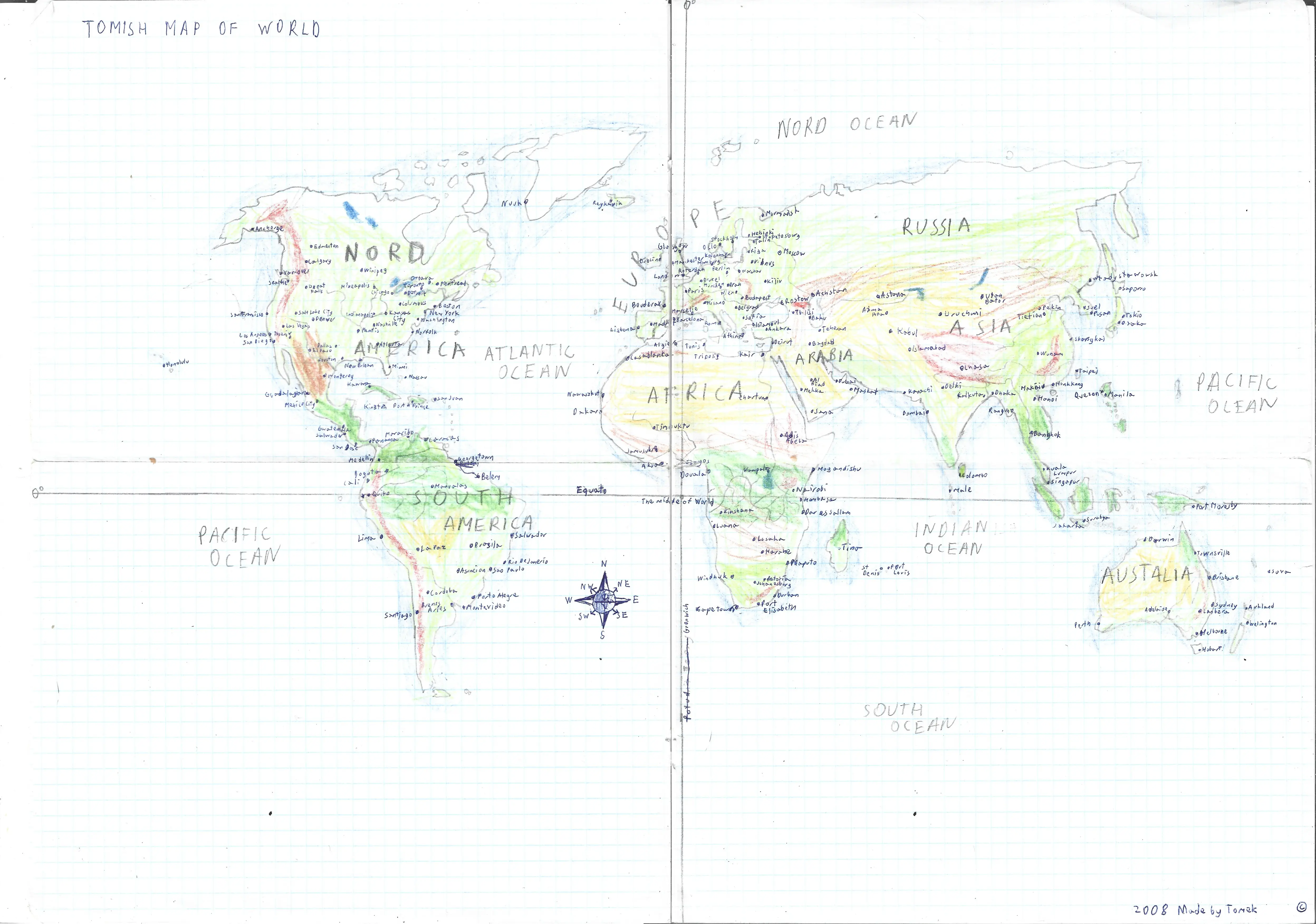
Tomish Map of World - whatever that means
I tried multiple times to draw the map of the world from memory but almost always, while drawing from west to east (starting from Alaska) I run out of space on the east and made the map too long so the Pacific was mostly cut out. Luckily on this map from 2008 I succesfully avoided that! Shapes of the landmasses looks not that bad, New Zealand is a bit to close to Austalia but it's fine, all the archipelagos nord of Russia are missing but there is nothing of interest out there anyway (except carefully placed Wrangle Island, the mammoths' last habitat) and colors of the bioms match up the real world quite accordingly, so I give it a solid 4/10 score.
However... back in those happier times my English was even less of a native level than today, and typos, lack of 'the' article and badly remembered names happened constantly. "Mogandishu" hurts me the most as other mistypes certainly are not that visible, just don't look too long at it.
Because my maps of the real world ain't that good so I don't show them, especially older ones that, unlike my old fictional maps which I still admire, are extremely cringeful and politically stupid. Besides, for me in order to get more interested in creating real maps I would need to gather some original data or be uniquely well designed, but again, I don't have skills nor patience at this moment of my life.
As of right now the website have "project" in the name, but it's actually just my fun personal site with my drawings in it. The maps above are just showing what I was able to create and what previous experiences I have.
I don't know. I wish soon, but given limited time and my refusal of making maps in the same or worse technology as I used to make, I don't know when I find the willpower and inspiration to create something new.
When it comes to hand-drawn maps: I don't have them physically anymore, I've thrown them out while moving out. But before I do, I spent an entire day for scanning my old papers, and some of them are shown here. Digitalizing them would be the most sensible approach to finish them, but when I finally got the skillset to make "next generation digital maps" I will have some other ideas than those old doodles.
When it comes to digital maps: I'm just too busy to sit down on my computer and focus on carefully drawing and placing stuff. I lost my interest in doing static maps a bit as I'm numb butI have some ideas. I gotta finally start making transit map schemes as I love metro maps but can't really make them look neat because of lack of practice.
Well, I really like the complexity, details, colors and icons of comtemporary maps. Medieval/fantasy maps are harder to properly draw and the 'old paper' look is hard to replicate on the widely available white paper. Also I like to draw on graph ruled papersheets (especially when the scale is 1cm - 2km, then each square is equally 1 sqr km which really helps me visualize the space) but it looks really out of place. In general I'm more modernist and not medieval type of guy, but I usually don't go too much far into the future as the technologies and layouts of cities will probably get so alien that it's not that relatable for me, sooo..
I understand, but I try my best to be well informed. My basic political views was always "I don't like the actual wars" and "No matter the income or origin, all people should be able to have peaceful life". Drawing alt-hist maps is fun but making them reality is very much serious topic. I've made a lot of totally biased geopolitic maps in the past and now I'm thinking about it more carefully.
I want to write about my political views on this site in the future, as I need to organize them into topics, my head is chokefull of information about all the countries, leaders and histories but I've never compiled it into some cohesive story. I can already say that I consider myself left-leaning and hate autocrats of all sorts (Trump, Xi, Putin, Netanjahu, Orban, those sort of guys), but absolutely nothing is simple and solutions like getting rid of any of them would only make things worse without a plan, like Libya without that bastard Gaddafi.

I know.
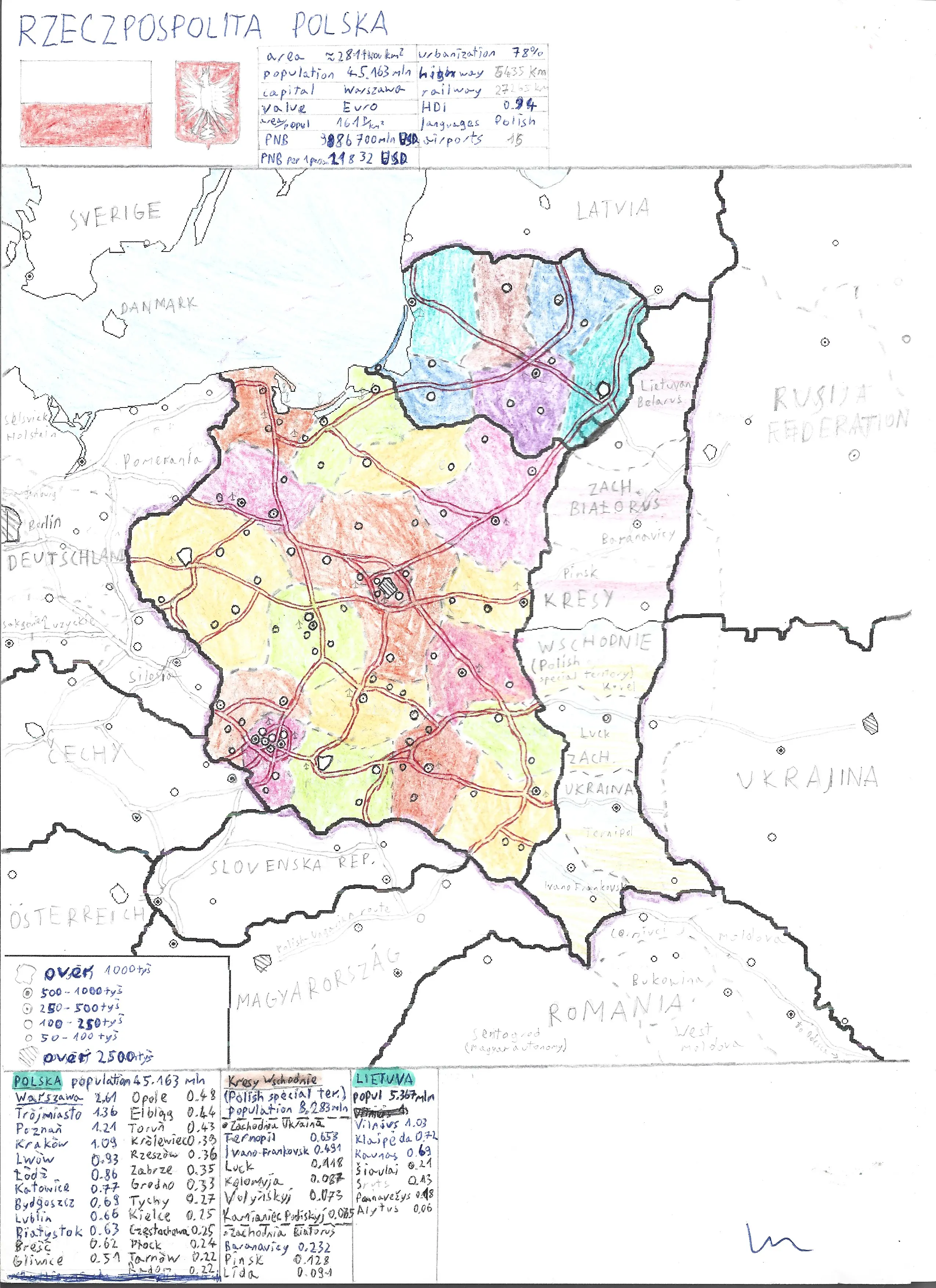
Many maps that I've made when I was a teenager have this kind of bias towards Ukraine and Belarus, which after the russian invasion in 2022, I regret immensely, even though I've never ever showed them to almost anybody. Slava Ukrainii and Żywie Biełaruś!